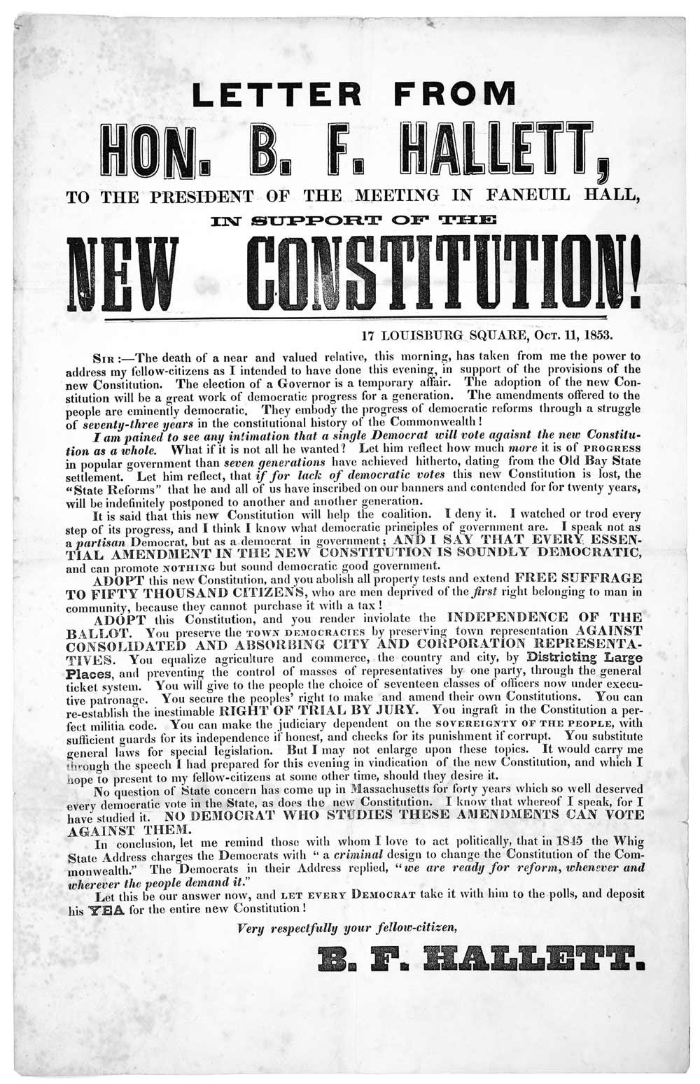
Now it’s time to put everything together. Like good writing, good typography isn’t determined by elements in isolation but by the relationship of those elements and the effect of the whole.
So far we’ve looked at typographic rules individually. In this chapter, we’ll apply these rules to some common legal documents. Your goal is to get better at seeing typographic flaws in layouts and fixing them.
Each sample document is shown as a before-and-after demonstration:
The samples in this chapter were created with Microsoft Word—no special trickery was used. (The names and situations in the sample documents are, of course, fictional.)