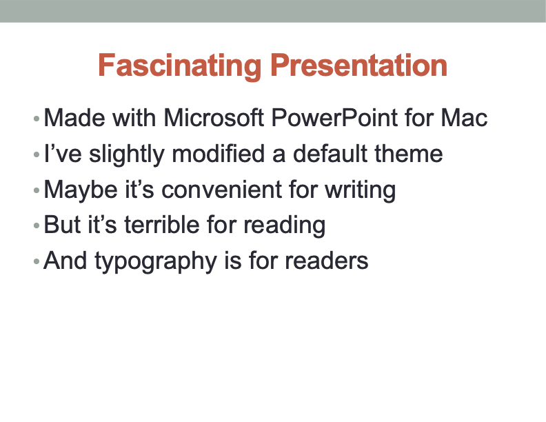
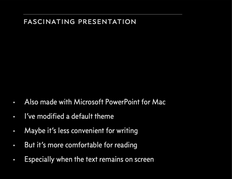
Digital presentations are infamous for their terrible typography. But I blame those who create the default templates for these programs. The qualities that make these layouts cheerful and attractive on your laptop often make them intolerable to an audience.
Why is that? When you’re writing your presentation, you’re probably sitting in a well-lit space, looking at your slides on a relatively small screen. In that context, slides with bright backgrounds and large type are fine. Your audience, however, will likely be in a dim room, viewing the slides at a much larger size. To them, the bright backgrounds and large type will be as pleasant as staring into a flashlight.
This insight yields a simple tip that will improve any presentation: choose typography for your presentation based on the size and lighting conditions where it will be displayed.
Giant white rectangle.
Boring system font.
Point size too large.
Line spacing too tight.
Huge centered headline.
When you’re designing for reading in the dark, your goal is to get the words on screen using the fewest photons. So start your presentation with a black background and a thin sans serif font that’s about 50% gray (not pure white). You can always brighten it later.
Pick a base point size that lets you fit 12–15 lines of text on screen. Not that you’ll ever be putting that much on a slide. (I hope.) But that’s a comfortable reading size. As much as possible, use this point size on every slide—even if there’s only one line of text on screen. Constantly changing the point size between slides is annoying.
Beyond that, the other typographic guidelines apply. In particular, use color with restraint—prefer pale shades over bright ones. And avoid centered text.
Calm black rectangle.
Concourse font in pale gray.
Point size reduced; line spacing increased.
Headline neither huge nor centered.
More
“white space” (which in this case is actually black space).

