With grids of numbers, the typographic logic must follow the mathematical logic. If it doesn’t, your typography is likely to confuse or mislead your readers about the meaning of the numbers.
Unlike letters in words, a digit in a number has independent meaning based on its position relative to the decimal point (which may be implied). That’s how we can tell that the digits in
Your goal when typesetting grids of numbers is to make sure the typography reflects the underlying meaning of the number. To do this, there is one golden rule: in any column, digits with the same meaning must be vertically aligned with each other. This means that you shouldn’t merely select everything and apply the same formatting to everything. Different kinds of numbers need different typography.
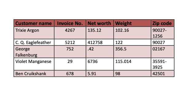
Numbers improperly aligned.
Table cell margins too small.
Needlessly thick rules and borders.
Line spacing uneven.
Inapt system font (Calibri).
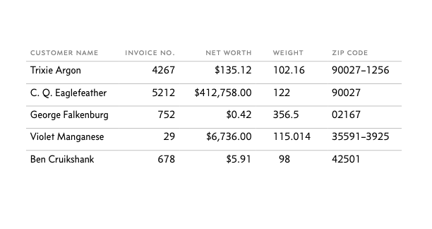
Invoice numbers aligned right.
Net-worth values have currency symbols, commas, and cents.
Weights and currency aligned with decimal tabs (see tabs and tab stops) .
Zip codes are aligned left.
Unnecessary colors and borders removed.
Line spacing even.
Concourse instead of Calibri.
As for the column labels, format those after you take care of the numbers. Sometimes you might need to make an inconsistent formatting choice to make them look right. For instance, in the revised example, the label
In a number less than 10,000, putting a comma after the thousands digit is generally a matter of style. For instance, both
$6736 and$6,736 are fine. But if those numbers are in a column (as in the example above ), the comma becomes mandatory. Without it,$6736 won’t quite line up with$16,736 .

