Litigators, I appreciate that motions are often written under deadline pressure that make good typography seem like an unaffordable luxury.
But when is it more important to have your reader’s full attention? You’re asking a judge to order a remedy—or, if you’re opposing, to refrain from ordering that remedy. The issue is important enough to have reached the judge’s desk. The ruling may not be appealable. Shouldn’t you put your best foot forward?
Or you can submit motions that look like they just rolled out of bed.
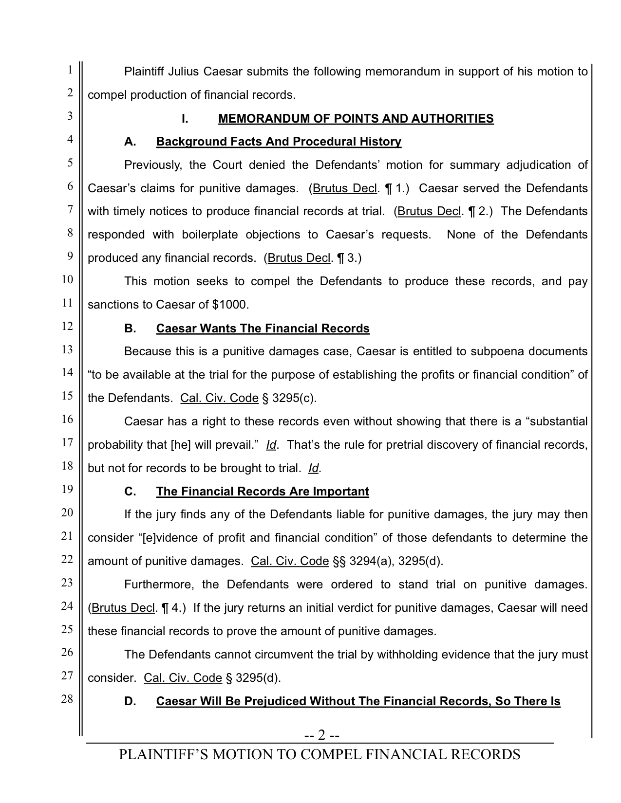
No letterspacing in all-caps heading.
Underlining throughout.
Arial used for body text and headings.
Word-by-word capitalization of subheadings.
Two spaces between sentences.
No hyphenation of justified text.Line length too wide; text too close to vertical rules.
Line numbers and body text misaligned.Last heading breaks onto next page.
Multiple hyphens around page number.
Point size of footer is too large.
No letterspacing in footer text.
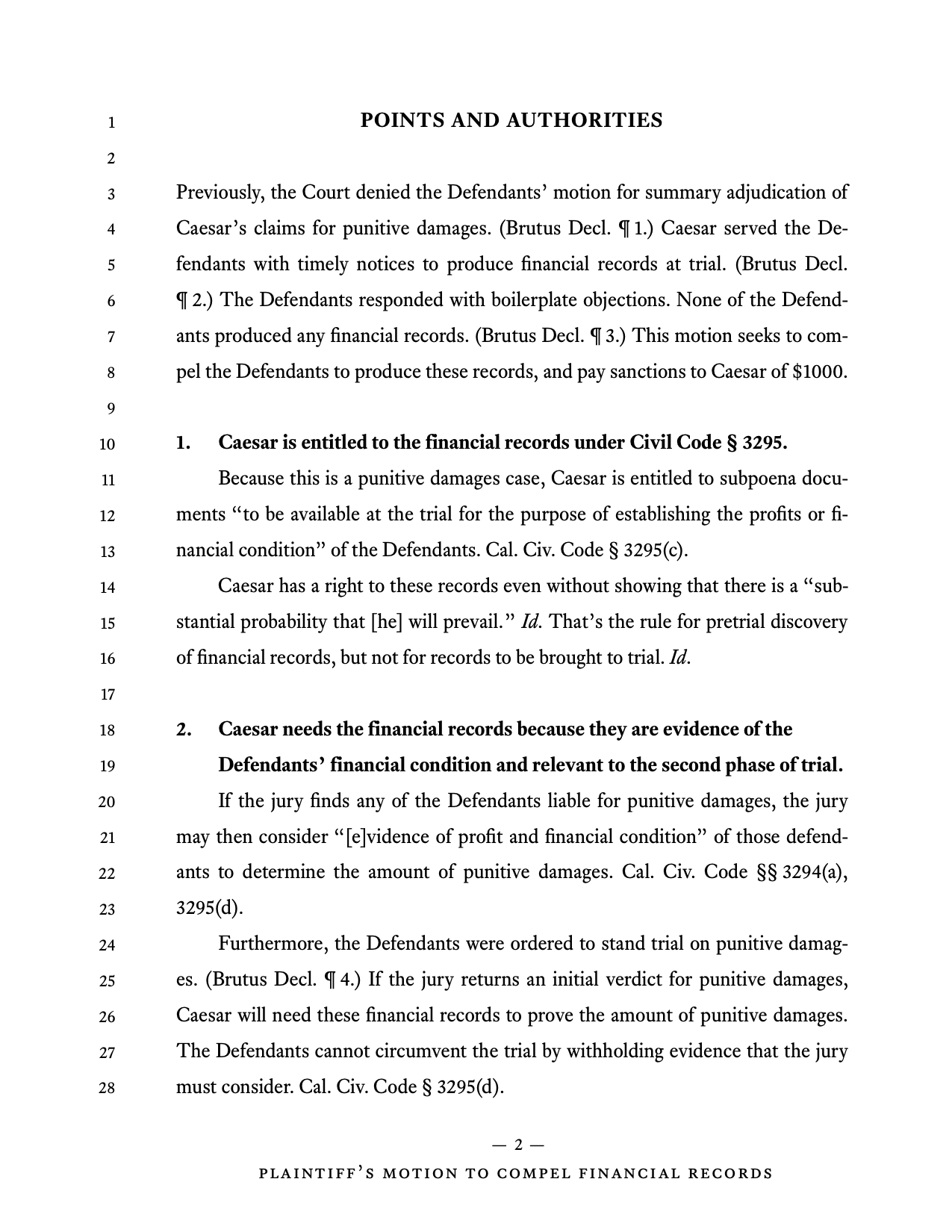
Letterspacing added to section label.
Underlining removed.
Arial replaced with Equity.
Capitalization corrected.
One space between sentences.
Text hyphenated.Line length narrowed; text farther from vertical rules.
Line numbers aligned with body text.Last heading moved to next page using keep lines together.
Em dashes around page number.
Footer point size reduced.
Letterspacing added to footer.
Notice how much white space has been added around the edges of the text and near the headings. Remember the ninth maxim of page layout—don’t fear white space. You needn’t fill up every square inch permitted by law. Yes, adding white space may lengthen the document slightly, because you’re using less space per page. The benefit is better typography and better legibility. (If you genuinely prefer the motion on the previous page, it’s time to pass this book along to a friend.)