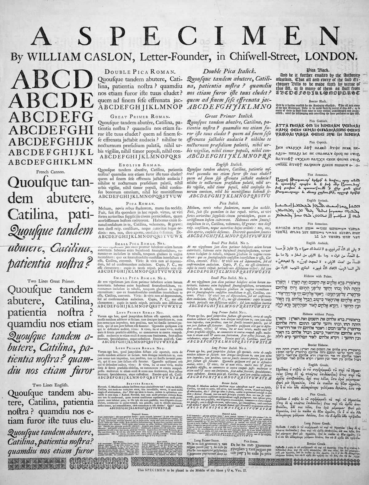
When I tell people I write about typography, they often say,
Yes and no. Sure, fonts are an important part of typography. But there’s much more to typography than fonts.
Similarly, there’s more to text formatting than picking a font. Formatting includes everything that affects the appearance of the words on the page—not just fonts, but also point size, bold and italic styling, and letterspacing.
The first part of this chapter covers basic and advanced formatting rules. The second part is a gallery of font recommendations—for those ready to look beyond the limitations of system fonts.
In this chapter, there aren’t as many bright lines between correct and incorrect habits as in the last chapter. You won’t be able to get by on rote application of rules. You’ll need to start making typographic judgments of your own.