We’ve seen how typewriter habits have retained a peculiar influence on the typography of today’s documents (e.g., research papers). These habits arose from the mechanical limitations of the typewriter. When the typewriter disappeared, so did the limitations. But the habits remained. Detached from their original justification, they’ve become pointless obstructions.
At times, the web has likewise suffered. For instance, the web-design habits of the mid-’90s influenced the 21st-century web much longer than they should have. Those habits also arose from the technological limitations of a previous era. In 2013, I catalogued five that had remained prevalent:
Tiny point sizes for body text.
Huge point sizes for headings.
Reliance on a small handful of system fonts, like Arial, Georgia, and Verdana.
Page edges crammed with inscrutable wads of navigational links.
Layouts built with large blocks of color.
We must set these habits aside, I implored. Though even then, I thought it would amount to yelling at clouds. The cargo cult was entrenched.
But website designers, credit is due. You’ve raised your game. At the time, I said
In particular, after spending decades as a font-free zone, it’s been cheering to see system fonts largely disappear from the web. True, many of the replacements are questionable free fonts, especially Google Fonts. But it’s a process, right? Certainly, I see a lot more Charter than I used to—that, I’ll take credit for.
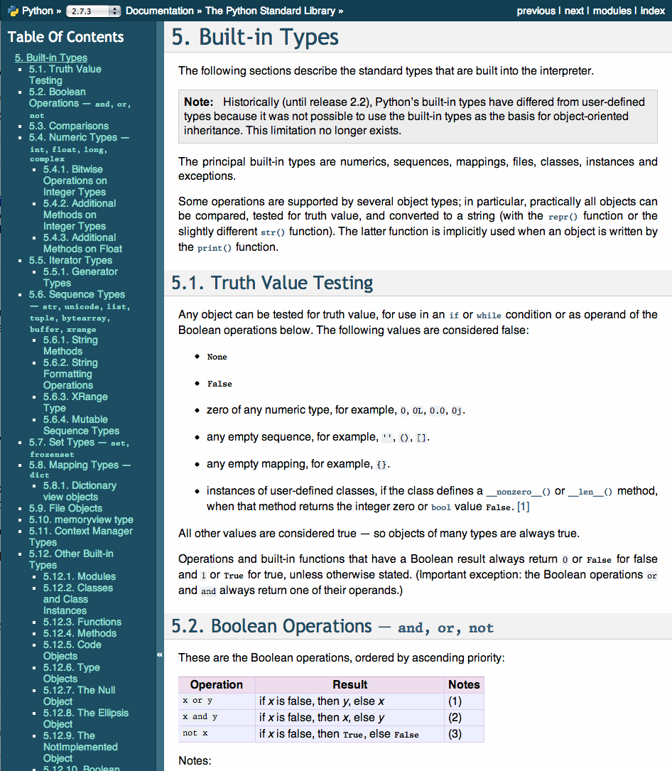
Even the Python documentation, which I cited last time as a cautionary example, has improved:

For a long time, web design kept itself in a state of neither here nor there. Like the poor worker of proverb, it was easiest to blame lack of progress on the tools. If you asked a web designer
But these excuses have gone stale, for three reasons:
Browser makers have adopted a faster tempo of major updates (mostly chasing Google Chrome, currently the dominant web browser). This policy has driven out older versions faster, making backward compatibility less of a hobble.
With typography, every major browser is now capable of producing sophisticated layouts.
I’ll go one step further: I predict we’ll no longer see major innovations in browser layout technology. What we’ve got today is likely as good as it gets.
HTML/CSS template systems like Bootstrap have smoothed over the complexities of making polished typographic layouts, in principle freeing designers to think about design rather than fiddly technical details.
I say
Trends rise and fall in all areas of design, of course. Web designers, however, have traditionally been more susceptible to looking laterally for ideas & inspiration, because it’s so easy to do. For instance, remember all the sites that put a video background on their home page? Gone a year later. Or when everyone used the 960 grid system? Also gone. Or today, all the sites with a

Against that backdrop, my typographic advice for websites is more a principle than a prescription.
To convince you to abandon the typewriter habits in printed documents, I’m able to cite a persuasive body of evidence: namely, the professional habits of the books, newspapers, and magazines we read daily. After 500 years of typographic practice, not every wheel needs to be reinvented.
The web, however, has no equivalent tradition. We can’t fill this gap merely by holding the web to print traditions. That would be limiting and illogical. But it’s equally illogical to refuse to compare the web to any benchmark on the grounds that it’s sui generis (because it’s not—the web is primarily a typographic medium), or that it’s new technology (because it’s not—the web is 25 years old), or that it’s still evolving (because that’s true of every technology, including print).
Browser layout technology has probably reached its peak. But that means web design is just getting started. So let’s not ride this cargo cult into the sunset. Instead, let’s infuse the web with visual ideas from elsewhere. Books. Posters. Art. Software. Other designed objects. Of this era. Of earlier eras. It’s all fair game. If you like stealing the ideas of others, great! Steal from better sources. (That’s the secret to whatever success I have, certainly.) Anything but another hamburger button.
As usual, don’t take my word for it. The esteemed Museum of Modern Art in New York has a vast design collection that includes fonts and video games. How many websites have they collected? Zero. How about the Cooper Hewitt? Also zero. Likewise, flip through any design annual, like Communication Arts. You’ll occasionally find a website recognized. But mostly other things.
This is a question of more import than just snooty scorekeeping. Because we can disagree about what design excellence means on the web. In fact, we should disagree, because that’s what stimulates experimentation and discovery. Doing it wrong is a prerequisite to doing it right.
The corollary is that if we refuse to experiment, we’ll never discover anything new. As web designers, we now have all the tools we need to make wonderful things. The flip side is that we’re officially out of excuses. If web design remains boring, we can’t blame browsers. We can’t blame Google. We can’t blame Bootstrap. We can’t blame 4G mobile connections. We can only blame ourselves.