Typography matters because it helps conserve the most valuable resource you have as a writer—reader attention.
Attention is the reader’s gift to you. That gift is precious. It is finite. And if you fail to be a respectful steward of that gift, it will be revoked.
Once your reader revokes the gift of attention, you’ve achieved only the lowest form of writing. Yes, you scattered some words across some pages. But your reader disappeared. So what was the point? Your writing might as well be a random string of characters. Like the proverbial tree falling in the woods, no one’s there to notice the difference.
Nevertheless, many legal writers adopt a high-risk model of reader attention. Instead of treating reader attention as precious, they treat it as an unlimited resource.
What could be more presumptuous? Or dangerous?
Writing as if you have unlimited reader attention is presumptuous because readers aren’t doing you a favor. Reading your writing is not their hobby. It’s their job. And their job involves paying attention to lots of other writing. Your judge has not set aside your motion for summary judgment so she can savor it during her upcoming vacation to Maui. More likely, it’s just one document in a pile of hundreds, all competing for her attention.
I’ll even go one better: I believe that most readers are looking for reasons to stop reading. Not because they’re malicious or aloof. They’re just being efficient. Readers who have other demands on their time—meaning, all of them—can’t afford to pay more attention than necessary. Thus, they’re always looking for the exit. Though legal writers routinely ignore this fact, they do so at their peril.
Writing as if you have unlimited reader attention is also dangerous, because running out of reader attention is fatal to your writing. The goal of legal writing is persuasion. Attention is a prerequisite for persuasion. Once the reader’s attention expires, you have no chance to persuade. You’re just giving a monologue in an empty theater.
If you believe reader attention is a valuable resource, then tools that help you conserve that resource are likewise valuable. Typography is one of those tools.
Good typography can help your reader devote less attention to the mechanics of reading and more attention to your message. Conversely, bad typography can distract your reader and undermine your message.
I’m not suggesting that the quality of your typography is more important than the quality of your writing. It’s not. But typography can make good writing even better.
Consider an oral argument in court. By the day of the hearing, you’ll have spent a lot of time on the structure and substance of your argument. But do you show up to court in jeans and sneakers? No, of course not. You wear proper court attire. And when you speak to the court, do you read from your notes in a monotone? No, of course not. You vary your cadence. You gesture. You extemporize.
You do these things because you don’t merely want to be seen and heard—you want to persuade. To persuade, you need to hold the court’s attention. And to hold that attention, you can’t undermine your argument with distractions.
It’s the same on the printed page. The text matters the most, but if that’s all that mattered, then everything could be set in 12-point Times New Roman. And that would be the equivalent of speaking in a monotone. In the same way that good speaking skills matter during an oral argument, good typography matters in a written document.
Compared to studying for the bar exam, it’s easy to learn the skills necessary for producing good typography. Beyond that, you need only the ability to form opinions about typography. And everyone who reads—even kids—can do this.
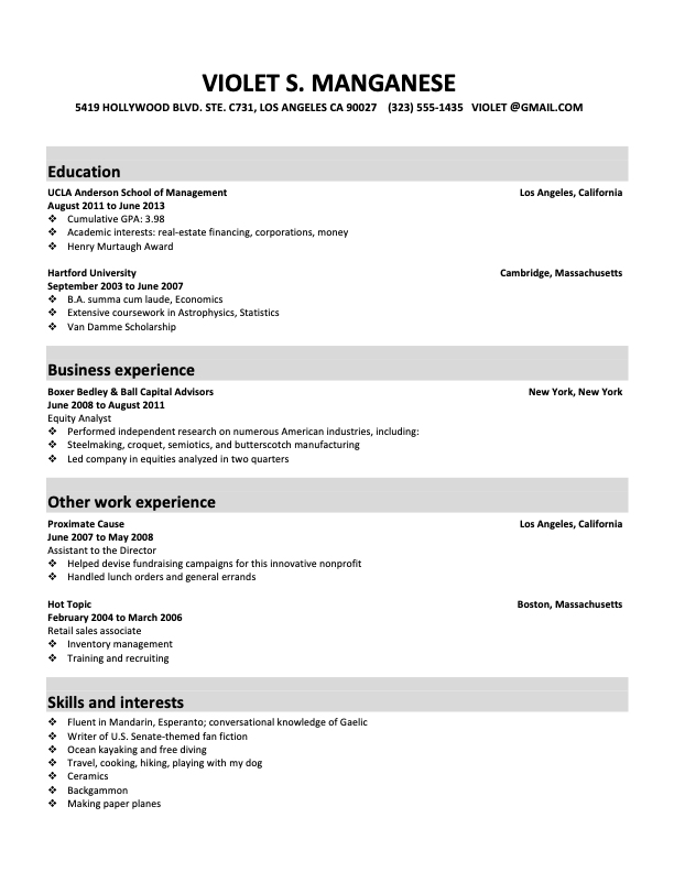
Unconvinced? Try this. On the next two pages are two résumés that you’ve received for an associate opening at your firm. Being a busy person, you only have two seconds to decide who gets the last interview slot. Who do you pick?
Don’t read the résumés—you don’t have time.
Just make a two-second decision.
Whose résumé got your attention—Violet’s (the first one) or Trixie’s (the second)? Whose résumé better persuaded you, in two seconds, that the candidate was worth interviewing?
I’m guessing you picked Trixie’s. But why? Maybe you’d say Trixie’s résumé looked more professional, neater, or better organized. All true, but those qualities don’t appear out of nowhere.
Or maybe you picked Violet’s. It doesn’t actually matter. Because if you look again, you’ll see that the credentials on the résumés are identical. So whatever preference you had was based purely on typography. Not only did you just prove that typography matters, you proved that it matters to you.
And if typography matters to you as a reader—a literate adult with no special visual skills or training—it matters to other similarly situated readers. Including everyone who reads your work.
Writers skeptical of typography often say,
Typography matters. The only question is whether you—as a writer and as a lawyer— are going to neglect it.
The substance–presentation distinction has always been a false dichotomy, because the two overlap. Juries, for instance, are not merely allowed but encouraged to draw conclusions about witness credibility—and by extension, the facts themselves—from the presentation of the testimony. (See, e.g., California Civil Jury Instruction 5003, which tells the jury to consider
“How did the witness look, act, and speak while testifying?”)

