Whether it’s a settlement agreement in PDF, a commercial lease on paper, or a terms-of-service agreement on a website, contracts are a diverse class of documents. Therefore, my typographic advice is more a principle than a prescription.
Let’s move past the self-serving myth that typography in contracts doesn’t matter because people must read them. Wrong. As I said in why does typography matter, readers are always looking for the exit. So the most we can say is that people are supposed to read contracts. As writers, we can encourage them. But can we force them? No way.
In fact, it would be wiser for drafters to assume that most contracts go unread. Why? Because no one wants to read a contract. And most contracts are poorly designed. Therefore, it doesn’t matter that people must read them. At best, they’re reading opportunistically. At worst, not at all.
For instance, the other day, a certain music service made me promise that I had read their 20,551-word contract—3,276 in all caps—before I could buy a $1.29 song. What do you think I actually did? Right. What would you do? The same thing. And everyone else? They’re no different.
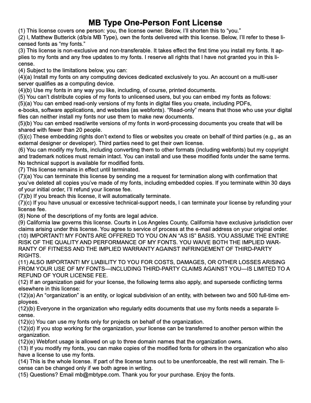
Here’s what I did when I had to write my own software license. We see these all the time. They’re reliably careless and awful.
Boring system font.
Line spacing too tight.Small page margins create an illegible line length.
No space between paragraphs or first-line indents.
Unnecessary use of all caps.
Paragraph numbers hard to see.
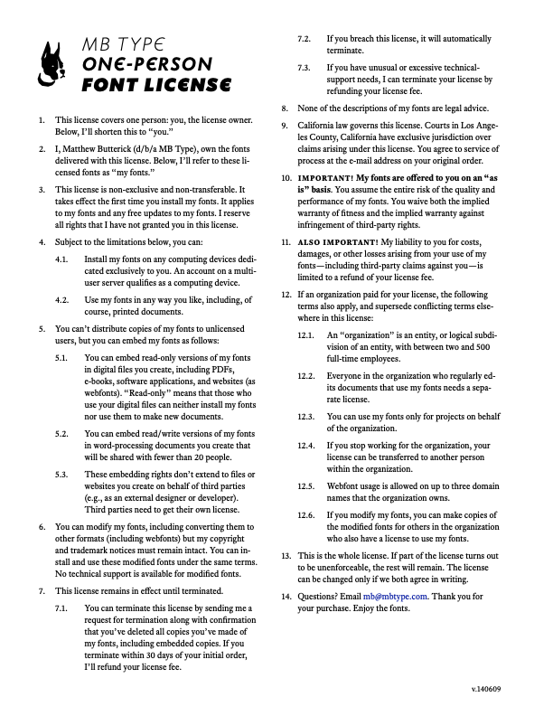
A contract is irreducibly complex in terms of the elements that must go on the page (headings, words, numbers, etc.). Thus, improving contract typography relies on two maneuvers. First, maximizing the visual effectiveness of existing elements. Second, using white space whenever possible for structure and emphasis, rather than adding more elements.
Columns create a more comfortable line length.
Equity for body text; Concourse for the headline.Cleaner paragraph numbering, with space between paragraphs and logical indenting.
Line spacing loosened.
No caps. Sparing use of bold or italic for emphasis.
Arguably, a larger point size would be optimal—the body text here is set at 10 point—but I wanted to fit everything onto one page.
One of the most tenacious urban legends in legal typography is the belief in the infallibility of caps in contracts. Yes, there are statutes that require caps for certain provisions. But these are limited in scope. In general, caps in contracts are irritating for the usual reasons: they make text harder to read and more likely to be skipped.
Some lawyers have nevertheless insisted that caps reliably satisfy laws requiring
“conspicuous” text, many of which are derived from the Uniform Commercial Code. Oh really? The UCC defines“conspicuous” as“presented [so] that a reasonable person ... ought to have noticed it”, and noting that“[w]hether a term is‘conspicuous’ or not is a decision for the court.” UCC § 1-201(b)(10). On that point, the Ninth Circuit has held that“[l]awyers who think their caps lock keys are instant‘make conspicuous’ buttons are deluded.” In re Bassett, 285 F.3d 882, 886 (9th Cir. 2002). I concur.

