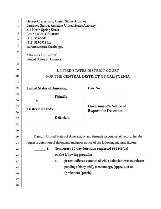
If this book were a law-school class, reformatting a caption page could be the final exam. Caption pages pack a lot of typographic issues into a small area. How many can you spot?
Monospaced font.
Too much text in all caps.
No letterspacing of caps.Unnecessary underlining.
Line spacing too tight.
Rules and borders made out of punctuation.Vertical rules too thick.
First-line indent is too large.
Line numbers don’t align with body text.
Inconsistent capitalization in heading.
Awkward line break in heading.
The best way to lay out a caption page is with a table. At minimum, the party names and title should go in a two-column table, like so:
| Party names | Title |
You can also start the table at the top of the page and put the attorney names and court name in it too. That’s how I prefer to do it—the table makes it easy to adjust the position of each element. To make cells spanning two columns, add new rows and then merge the cells in each row.
| Attorney names | |
| Court name | |
| Party names | Title |
The text at the bottom of the page starts outside the table.
Call me a scofflaw, but I’ve never aligned the text in the top half of the page to the line numbers. It’s possible, but it takes a lot of fiddling and often results in less legible text.
Monospaced font replaced with Equity.
All caps replaced with bold, or nothing. (Small caps would
be another option.)
Address lines separated with hard line breaks.
Letterspacing added to court name.Underlining removed.
Line spacing looser in top half of page.
Rules and borders made with table-cell borders.
Point size of party names and title slightly bigger than other text.First-line indent reduced.
Line numbers align with body text.
Capitalization in heading fixed.
Hard line break inserted in heading before“on”.
Recall the second maxim of page layout— divide the page into foreground and background. The vertical rules on a caption page should seem like part of the background — they should not be darker or more prominent than the body text in the foreground. Removing unnecessary rules will make the body text area feel less cramped. Use as few as possible. In this revised version, I removed the vertical rule on the right and one on the left. I made the remaining rule thinner and moved it away from the text.
Court filings have ugly typography as a matter of habit, not requirement. Court rules can be strict, but there’s still plenty of room for good typography (see how to interpret court rules).

