Good typography reinforces the goals of the text.
Almost all texts communicate a set of points (Summary judgment should be denied for three reasons). Sometimes a text also needs to instruct the reader (Add lines 7 through 21 and enter the total here). Other texts offer warnings or admonitions (You must be 48 inches tall to ride). In every case, good typography supports and reinforces the message. Good typography makes the text more effective.
Three subsidiary propositions flow from this:
Good typography is measured by how well it reinforces the goals of the text, not by some abstract scale of merit. Typographic choices that work for one text won’t necessarily work for another. Corollary: good typographers don’t rely on rote solutions. One size never fits all.
For a given text, many typographic solutions would work equally well. Typography is not an algebra problem with one correct answer.
Your ability to produce good typography depends on how well you understand the goals of your text, not on taste or visual training. Corollary: if you misunderstand the goals of your text, good typography becomes purely a matter of luck.
Pause to consider proposition #3. Typography is visual, so it’s easy to conclude that it’s primarily an artistic or aesthetic pursuit. Not so. Typography is primarily utilitarian.
Therefore, good typography is measured on a utilitarian yardstick. Typography that is aesthetically pleasant, but that doesn’t reinforce the goals of the text, is a failure. Typography that reinforces the goals of the text, even if aesthetically unpleasant, is a success.
Does that mean that effective typography can be ugly? Sure. Sometimes ugly is better than pretty.
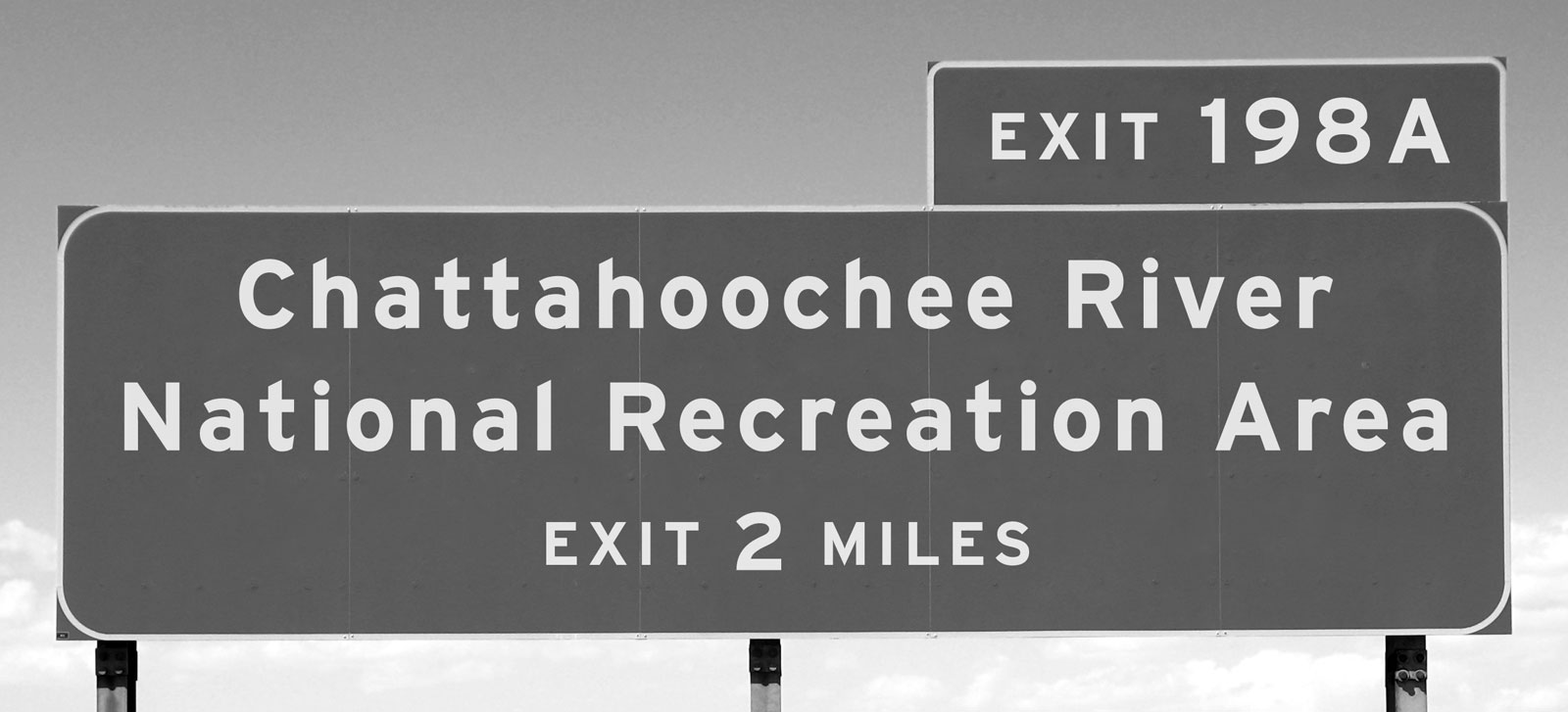
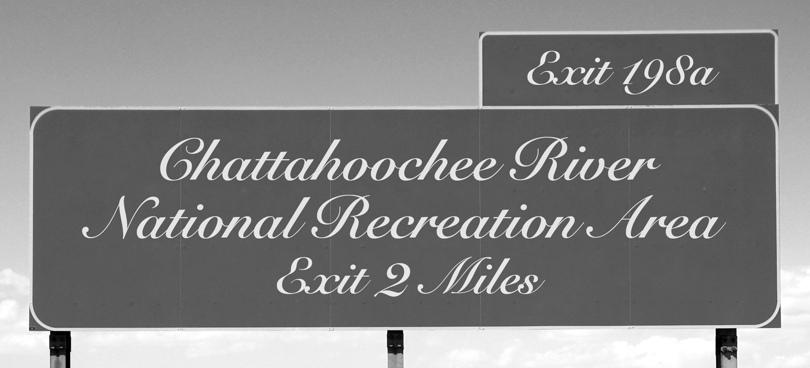
Look at the highway signs again.


The script font used on the second sign could be called
The script font may be prettier, but in this context, it’s bad typography because it’s not suited to the task. Conversely, the highway-signage font would look terrible on a wedding invitation, where the script font would be appropriate.
A related example:
Here, the same font is used in all three versions of this sign. But the first two signs fail to deliver the message—the speed limit is 75—because the typography undermines the text. The most important element is the number 75. Also important is the caption speed limit. Only the third version gets the balance right. It’s the only example of good typography among the three.
Use this principle to test the quality of your own typographic work. The advantage of a utilitarian benchmark over an aesthetic one is that it doesn’t require aesthetic judgment. Trust me—if you’re just starting out in typography, you’ll produce some ugly work. Don’t worry. If it’s ugly and effective, you’re making progress.
Ask yourself: what do readers want from your document? And is your typography helping them get it?
For instance, suppose you’re filing a motion in court. As a writer, you have two main goals:
Tell the judge what remedy you’re seeking.
Persuade the judge that you’re entitled to the remedy.
If so, which of these typographic options is better?
Option 1
YOU ARE HEREBY NOTIFIED that at a date and time to be determined, in Dept. 21 of the above-entitled court, plaintiff TRIXIE ARGON will move the Court for an order that defendant MEGACORP produce financial records requested by Ms. Argon and reimburse Ms. Argon’s costs to bring this motion. This motion is made on the ground that Ms. Argon served MegaCorp with a valid notice to produce financial records at trial. Cal. Civ. Proc. Code § 1987(c); Cal. Civ. Code § 3295(c). MegaCorp served objections and refused to comply.
Option 2
You are hereby notified that at a date and time to be determined, in Dept. 21 of the above-entitled court, plaintiff Trixie Argon will move the Court for an order that defendant MegaCorp:
1. Produce financial records requested by Ms. Argon and
2. Reimburse Ms. Argon’s costs to bring this motion.
This motion is made on the ground that Ms. Argon served MegaCorp with a valid notice to produce financial records at trial. Cal. Civ. Proc. Code § 1987(c); Cal. Civ. Code § 3295(c). MegaCorp served objections and refused to comply.
Option 1 emphasizes the first four words—who cares about those?—and the party names, which would have been emphasized adequately on the caption page. Given your two goals, the typography in Option 1 doesn’t help the judge understand what remedy you’re seeking or why. Therefore, this typography fails.
Option 2, however, removes the unnecessary emphasis from the first part of the paragraph. Instead, it uses white space, a numbered list, and bold styling to draw the judge’s attention to the remedies you’re seeking. This typography is better because it reinforces one of the goals of the text.
Reinforcing the goals of the text is a simple principle, but lawyers have a penchant for self-defeating typography. For instance, lawyers drafting contracts will often put important paragraphs in all caps. But caps are more tiring to read than regular text. (Don’t take my word for it—click here and see for yourself.) So the most likely result of this typographic choice is that readers will pay less attention to the important paragraphs in the contract, not more.